Is your brand using the colors it should? Sounds confusing? Let us clarify.
How would you find a CTA button in white appealing? Or a fitness brand using pale lavender? Neither seems to fit the purpose, right?
This isn’t just common sense. Colors are more than decoration — brands use color psychology in marketing to build personality, influence consumer psychology in marketing, and drive purchases.
The right colors evoke specific emotions. Bright hues like red trigger impulse buying, while blue encourages thoughtful decisions. Using colors strategically helps reinforce your branding colors and impacts how brands use color to influence buying decisions. In this article, we’ll explain exactly how to leverage color psychology in business for maximum impact.
What is Color Psychology?
Color psychology in marketing is the study of how colors affect emotions and behavior. Colors influence how consumers perceive brands and make purchasing decisions. A study by Loyola University found that color determines brand recognition by 80%.
Understanding color psychology in branding provides a framework for building memorable and meaningful brand experiences. From logos to websites, deliberate color choices shape how customers feel about your brand.
How Does Color Psychology Impact Your Brand
Colors influence how customers see and interact with your brand. Emotions drive action, and color evokes emotion — so your palette can directly impact purchasing decisions. In fact, 85% of consumers say color is a key factor in choosing a brand.
Every brand touchpoint — from packaging to web design — should reinforce your branding colors and reflect your personality. While culture and context can affect perception, studies show certain emotional reactions to colors are universal. Understanding how colors like orange, gray, or muted tones evoke feelings such as hope or harmony can elevate your branding strategy and impact consumer psychology in marketing.
The Psychology of 10 Popular Colors
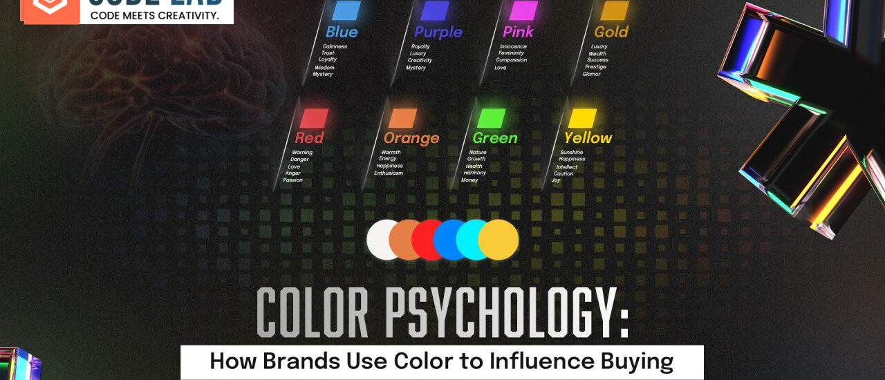
Color psychology is essential in branding since it determines how customers think about products, experiences, and businesses. Some of the most popular and well-known colors in marketing have their own emotional connotation and branding strategies.
Red
Red is bold, urgent, and emotionally charged. It inspires passion and action, making it perfect for food, entertainment, and retail. Brands like Coca-Cola, Netflix, and Target use red to command attention. However, red can feel too aggressive for wellness or luxury brands.
Blue
Blue evokes trust, stability, and dependability — ideal for finance, healthcare, and tech. IBM, Facebook, and PayPal use blue to project professionalism. But it can feel cold for lifestyle brands seeking warmth or creativity.

Yellow
Yellow communicates optimism, energy, and clarity. It grabs attention and is often used for kids’ products, fast food, or travel. McDonald’s and IKEA are prime examples. Too much yellow, however, can overwhelm high-end or serene brands.
Green
Green symbolizes growth, balance, and wellness. It resonates with environmental, organic, and sustainability-focused brands. Whole Foods and Spotify use green effectively, but it may feel too mild for urgent or luxury brands.
Black
Black conveys sophistication, power, and luxury. Apple, Chanel, and Nike leverage black for elegance and authority. But black may appear too serious for kids’ brands or wellness companies.
White
White communicates purity, simplicity, and sophistication. Brands like Apple, Airbnb, and ASOS use white for minimalism and cleanliness. Without complementary colors, white can feel cold or clinical.
Orange
Orange combines energy and cheerfulness. It’s friendly, playful, and youthful — used by Fanta, Nickelodeon, and Home Depot. Luxury brands may find it too casual.
Purple
Purple suggests creativity, richness, and spirituality. Cadbury and Hallmark use it to convey luxury and emotional depth. However, it may not resonate with no-frills or mass-market audiences.
Pink
Pink conveys femininity, warmth, and playfulness. Barbie, Victoria’s Secret, and Baskin-Robbins use pink to charm and engage. But it can alienate masculine or broader audiences if not balanced carefully.
Gray
Gray communicates neutrality, balance, and formality. Mercedes-Benz and Adobe use gray to convey maturity and professionalism. Alone, gray may feel cold or emotionless for lifestyle brands.
Conclusion
Color selection is more than aesthetics. It’s a strategic decision that communicates your brand’s values and personality. Brands that master color psychology in marketing create identities that resonate emotionally, influencing consumer psychology and driving sales.
Choose your branding colors wisely, use them strategically, and watch your brand grow. Understanding how brands use color to influence buying decisions is the key to creating a memorable and impactful brand.


My brother suggested I might like this blog. He was entirely right.
This post actually made my day. You cann’t imagine
simply how much time I had spent for this information! Thanks!
I always recommend this site to friends—great content every
time.